With the immense usage of Smartphones over the years, its been very essential for any website to be fully responsive in nature and compatible to the variety of smart device resolutions such as large screen desktops, laptops, iPads, tablets, phablets and Smartphones etc.
Candid Technologies is highly experienced in responsive website development and till date we have successfully developed & delivered 240+ responsive websites to our clients across the world. We build responsive websites with HTML5 and CSS3 and manage a fluid user interface which renders perfectly on mobile and tablet devices as it does on desktops.
Our team holds proven track record of responsive websites development with responsive frameworks like Bootstrap, Foundation 5 and Skeleton. We are equally experienced in developing responsive websites with Custom media queries without using any framework.
We ensure that the responsive websites we are developing and delivering to you is fully tested on physical devices such as iPhone, iPad & Android devices and cross browser compatible with IE8+, Safari, Chrome & Firefox.
We also take the responsibility to ensure that your responsive website is optimised well in terms of performance, increased page speed and passed with Google Mobile friendly test, which helps you in going a milestone ahead of your competitors.
Moreover, we are professionals in building high end responsive web applications based on either of PHP platforms like WordPress, Drupal, Joomla, Magento, WooCommerce, Shopify, CodeIgniter, Laravel, Symphony2 etc.
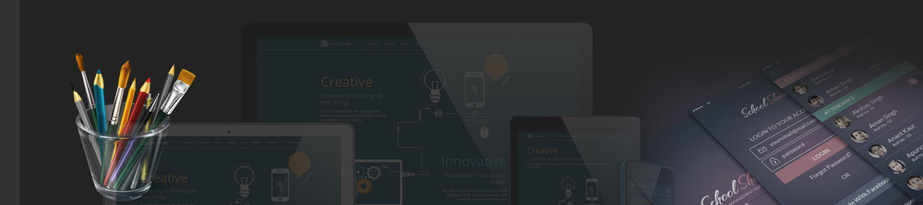
Below is Glimpse of our responsive website designing and development portfolio.
Need a responsive website? Call us right away +91 731 308 5530 or email us info@candidtechnologies.net and you’ll hear from us within 24 business hours.